
In one sentence: a stock chart is just a record of who won the fight between buyers and sellers over a given stretch of time, and once you know how to read one candle, you basically know how to read all of them.
The one thing you need to unlearn first
If you've never opened a real chart before, the first instinct is to treat it like a foreign language — rows of red and green bars that seem to mean something only if you already know the code. It's not a code. Every candlestick on a chart is answering the exact same four questions, every single time: where did the price start, where did it end, how high did it get pushed, and how low did it get dragged. That's it. Once you can answer those four questions for one candle, you can answer them for a thousand candles, because every candle on every chart for every stock is built the same way.
Anatomy of a single candlestick
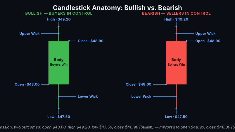
Let's use one real candle and walk through it piece by piece. Say a stock opens the trading day at $48.00. Over the course of the day it gets pushed as high as $49.20, gets sold down as low as $47.50, and finishes the day at $48.90.
Open: $48.00 — the first price traded during this period.
High: $49.20 — the highest price traded during this period.
Low: $47.50 — the lowest price traded during this period.
Close: $48.90 — the last price traded during this period.
The body: the thick block runs from $48.00 (open) to $48.90 (close). Because the close is above the open, the body is colored green — buyers won this period. If the close had landed below the open, that same block would be colored red instead, meaning sellers won.
The upper wick: the thin line running from the top of the body ($48.90) up to the high ($49.20). It shows price got pushed up to $49.20 at some point, but sellers stepped in and knocked it back down before the period ended — a push that got rejected.
The lower wick: the thin line running from the bottom of the body ($48.00) down to the low ($47.50). It shows price dipped to $47.50 at some point, but buyers stepped in and bought it back up before the period closed — a dip that got bought.
That's the whole candle. Body color tells you who won. Body length tells you by how much. Wick length tells you how much of a fight happened along the way that didn't survive to the close. A candle with a long lower wick and a small body sitting near the top, for example, is telling you a very specific story: sellers tried to push the price down hard, and buyers absorbed all of it and dragged the close back up near the high. That's a different story than a candle with the exact same open and close but no wicks at all, which just means price moved in a straight line with no real pushback either direction. Same open, same close, completely different fight.
What a series of candles tells you
One candle tells you what happened in one period. A row of them tells you what's happening over time, and that's where trends come from. Two tools do most of the work here.
The moving average. A 20-day moving average is just the average closing price over the last 20 days, recalculated fresh every day and plotted as a line running underneath (or through) the candles. When that line is sloping upward and price is consistently trading above it — closes holding above the line, dips getting bought before they cross under it — that's the textbook definition of an uptrend. It's not a prediction, it's a description: on average, buyers have been willing to pay more over time, and the line is just a smoothed-out way of seeing that without getting distracted by any single day's noise.
Volume. Underneath the candles you'll usually see a row of bars, one per period, showing how many shares traded. Volume is what tells you whether a price move has real conviction behind it or not. If a stock is climbing and the volume bars on up days are noticeably taller than the bars on down days, that means more shares are changing hands when price rises than when it falls — real buying pressure is showing up, not just a lack of sellers. Compare that to a stock drifting upward on shrinking volume, where each up day trades fewer shares than the last. That's a weaker signal. The price is going up, technically, but fewer people are actually participating in pushing it there, which makes the move easier to reverse. Price tells you what happened. Volume tells you how much you should trust it.
Timeframes: same anatomy, different zoom
Every candle you've just read about can represent any length of time — the anatomy never changes, only the zoom level does. A "daily chart" means each candle is one full trading day: one open at 9:30 AM, one close at 4:00 PM, and whatever high and low happened in between. An "intraday" chart, like a 5-minute chart, means each candle covers just five minutes: an open, a high, a low, and a close, all inside that single five-minute window, with a brand new candle starting the moment the last one ends. Zoom out further and you get weekly or monthly candles, each one compressing an entire week or month into a single open-high-low-close.
The timeframe you should be looking at depends on how long you actually plan to hold the trade. If you're closing positions same-day, a 5-minute or 15-minute chart matches how fast your decisions need to happen. If you're holding for days or weeks, a daily chart is the one that actually reflects your holding period — zooming into 5-minute candles when you're holding for two weeks just shows you noise that has nothing to do with your actual trade.
How GenZTrade helps you find these setups
Reading one candle is a skill. Scrolling through hundreds of charts looking for the moment price and volume line up the way they're supposed to is a time sink, and it's the part that burns out most beginners before they get good at it. GenZTrade's High Volume Points tool takes the exact reading you just learned — where has volume actually piled up at a given price, which is what creates real support and resistance — and calculates those levels automatically instead of asking you to eyeball it. Momentum Scanner does the other half of the work: instead of you manually flipping through hundreds of tickers looking for a chart that already shows a rising moving average with volume confirming the move, it surfaces the ones already showing that pattern, so you're spending your time evaluating setups instead of hunting for them.
Bottom line
A chart is a record, not a crystal ball. Everything covered here — the body, the wicks, the moving average, the volume bars — tells you what already happened and what buyers and sellers are doing right now. It does not tell you what happens next with any certainty. Reading a chart well means you can describe the current fight accurately and size up which side currently has the edge; it does not mean you can predict who wins tomorrow. That's the honest way to think about charts from day one — they're a tool for stacking probability in your favor, not a tool for prediction, and anyone who tells you otherwise is selling something.
Comments (0)